Sunday 26 October 2014

I.D Love issue

I.D magazine was created in 1980 and ever since has been a inspiration of fashion culture. Though it is more than just a fashion magazine, it includes articles about modern life and how it impacts fashion, music, love and todays art forms. It is a great source to discover different photographers and designers and is personally one of my favourite forms of magazines because of its diversity to others such as Vogue and Elle, as it is more than just about the fashion, and centres identity which makes it more particular. I find it extraordinary because of the photography it includes and the stories behind them and how it focus's on youth culture and targets new fresh talent and has kept that element since it was founded.  One of the reasons I.D has became a popular magazine over the years, is because of its front covers. On each issue the cover model is winking and smiling, it is a visual representation of the magazines logo rather than including a graphical image, making it's presence a lot more interesting. This years fall issue focus's on Love and what it means to various amounts of people in the creative industry. This subject is especially extraordinary because this exactly is the feeling generally would agree to feel when they love something, wether it maybe their family members, pets, hobbies, passion, ambition or boyfriend/girlfriend/husband/wife. Everyone has a different perception of love which is what makes it so extraordinary, such as what someone would do for you or how it makes you look or what it does to you in the way you act or feel. However in the end, the meaning's of love always link together. What I also find alluring about this issue is the way the photographers have arranged the models how to pose, which links in with love. On each image where there is more than one person, they are touching in someway or looking at the other person, that makes them seem connected and makes the audience feel what the article is about and by reading the quotes and questions that surround the photographs, it presents the emotion and subject of what the issue is about, which is what also makes its a very good editorial magazine. The images below are what I consider to be the most strongest extraordinary and editorial of this source and what define this issue


.

Thursday 23 October 2014

Workshops

For the last three weeks we have been having workshop sessions with Tim. They have all been to help us expand our knowledge and skills with lighting that will benefit our photography that can make photographs extraordinary and different.

Week One: In our first week of workshop sessions, Tim brought us outside of Uni to show us how we can change the lighting by using a fill in flash that can be connected to the camera or hand help to be placed near the subject if need be. A reflector was also used so that the light from the flash is even on both sides so that it results in equal light on the subject. The fill in flash is useful for shoots when on location because it can change the light without needing any soft boxes or any other studio light.
Week Two: During the second session Tim took us a bit further outside Uni for a contrast in the image and also using a different lighting technique. This time we used a soft box light outside. It was interesting to see the difference from using a soft box light and a fill in flash from the previous week because of how different the light produces. The soft box initially made the background in the image look quite dark but brought out the subject really well.
Week Three: This session we had to recreate the lighting in a photograph of a model stood on a staircase in one of the building at Uni. We had to decide the equipment that was used and decide what would be best to impersonate this image. We used the DSLR, Elinchrom studio light, beauty dish and reflector. Overall the image we created was not far off as the original photograph had actually been edited on lightroom, that made most of the shadows a lot brighter.

Overall I have learned a fair deal from these workshops and I have found them very useful and will definitely use these in the near future to experiment and expand my work.

Sunday 19 October 2014

Photography in the 1960s

Photography in the 1960's presented the rock and roll lifestyle that many of the youth culture of this period were living. With thriving photographers such as David Bailey and Brian Duffy, the 60's has been captured and is has a very noticeable style that is simple but was completely different to what any other photographs had done before that time. The documentary film 'The Blow Up' presents famous photographers, models, film makers and artists of the 1960's and shows they worked and what work they produced. It is interesting to see the difference in photography in that era to the work of todays. There was no digital cameras or computers to edit photographs on, it was all done by film and then printed in the darkroom. David Bailey is no doubt the most recognised photographer of the 1960's because he photographed famous and everyone who was anyone at that time. The photography in the 60's also brought a new look to fashion, famous models such as Twiggy, presented this in magazines like vogue. Photography showed new and up coming trends on models that the audience would want to copy off and look like. Overall this era developed photography that still has influence today and has inspired many photographers from the 60's that is still relevant today. 
 
Some of Bailey famous portraits: 


Images From:  http://www.npg.org.uk/collections/search/person/mp05044/david-bailey?role=art

The British New Wave and Realism

The idea of realism is to have a sense of perception and knowledge and to be able to hear, see, feel, smell and taste. We as people have to rely on a reality being meditated for us such as the news, magazines, newspapers and the radio that feeds us information that we tend to believe. But the problem here is fidelity of representation and the thought of can we believe these sources of media. From the 1930's to the 1950's Britain these representations being challenged by its public because of the start of americanisation, that had the influence of Hollywood, that initially saw traditional home values go down the drain because the younger generation were getting an idea of a glamorous individual lifestyle that was shown through film. Anxieties of the Cold War were also always a problem, but the fact of new space technology and knowledge meant that satellites were now in space, which the public tended to question the government and their policies that made them think were they spying on you because of these giant electronic devices in space. The film industry noticed these problems and started to reflect them in new movies such as, 'The Blue Lamp' and 'Victim', that were both directed by Basil Dearden in the the 1950s and 1960s. These films were classed as kitchen sink films because they presented the domestic situations that the working class people of Britain could relate to. The British New Wave movement also the punk movement rise up, because these youths wanted to challenge anything and everything, which was seen as the angry new man image as they were expected to behave like their parents but instead went again them. As the youth culture started to get their own jobs outside of school and college, they began to have a disposable income that meant they had spare money to spend on their own music and clothes. In the 1950's women were seen to be wanted back in the kitchen and housewives were a common sight in a normal household. This created social problems that gave new ideas to the New Wave British cinema and addressed things that hollywood film did not such as, underage sex, adultery, homo-sexualtity, abortion and mixed race relationships, programmes like 'Saturday Night and Sunday Morning' and 'A Taste of Honey' addressed these enough. This meant that you could make something of yourself whatever class you were in. Overall the British New Wave saw a sense of realism like no other decade before, the 1950's and 1960's addressed issues that were common occurrences and situations that were real life. The film industry did not tip toe around these issues but presented them how they were happening in everyday life.

Careers in Photography

In todays Profession Studies lesson we looked at different career paths in photography that does not necessarily lead to being a photographer, which were:
  • Editor
  • Curator
  • Researcher
  • Teacher
  • Retoucher
  • Art's Organiser
  • Critic
  • Assistant
We then were given the task of focusing on one of the above, to find out more information on the following. I chose a Photography Critic as I have never thought or even new that my degree could lead into that career path. It was interesting to see what qualifications and skills are needed to be a critic, but overall I would not want to go down this route, at this present moment I could not see myself enjoying it, but it is useful to know what a critic does. Below is the research of a Photography Critic.
  • A Critic analyses the meaning behind the artists work and how good the quality of it is. They often report on the work in magazines, newspapers and websites to present their opinion, which can often make or break the artist. 
  • They must have a wide range of knowledge about art and the different genres it can branch out to and often have some sort of art based degree/MA/PH, who also have experience working with galleries, museums and something in journalistic.
  • They report on new and upcoming work but also could be previous work, such as a collection of the photographers work if they have been successful in their career, to celebrate it.
  • Critics present it in readable manner so that it is interesting to the audience that should sound intelligent and feel like they have really thought about the work.
  • It is useful to have your work looked at by a Critic because most of the time it can be used as constructive criticism that can help you develop in whatever skill or project that the photographer is following that could be used differently next time.
  • It should be an informative and honest opinion that should not insult the work but suggests ways in which could be improved.

Friday 17 October 2014

Photography Competitions

All year round many photography companies and associations organise competitions that can range from all different levels of photographers and normally have a certain theme, which the photographs that are entered will have to follow and present within their work. Prizes are part of the event that can be money, being part of an exhibition or the work being shown somewhere and sometimes often the most latest photography equipment. Competitions are a great way to get your work out there and become known in the photography world, which can often result in being spotted by business's and that may become commissioned jobs and overall benefit your work. In most cases it costs to enter a competition because that is what keeps it funded, it can range from £10 to £50, but is worth it in the long run if you win somewhere in the competition. One of the most crucial factors in entering a competition, is your statutory rights. It is so easy to enter what you think is a legitimate event that can take your copyright of your images away and use them for their use only and end up losing protection and right to your photographs. It is important to read carefully and make sure in the terms and conditions that your work will stay your own work.

Photography Competitions:

  • Sony World Photography Awards
The Sony Competition is one of the worlds leading photographic awards today. It launched in 2008 and its aim is to support the cultivating photographic culture in the world. They hope to look for new talent in the world of photography and is offered to all levels and experiences. There is an awards ceremony and includes a range of prizes and each category has a different theme and concept.
  • LensCulture Visual Storytelling Awards
This competition is focused on visual storytelling and is offered to all levels and genre's of photography. It is open to all themes and approaches and does not have much rules when what the photograph/s have to be about.
  • British Journal of Photography International Photography Award
The British Journal competition also has no theme and can be any style or genre. Anyone can enter, but the aspect has to be a recognised coherent series and the other a stunning single image, so you can either enter both categories or just one. The prize is an exhibition.
  • National Portrait Gallery Photographic Portrait Prize
  • Save the Children International Photography Commission
  • Travel Photographer of the Year
There are hundred more competitions, I have just named a hand full. I think it is important to enter competition because it means getting your work out there. As a student studying photography with not a major amount of experience, entering competitions will help me become more motivated in producing more work and push me into want to go further in the photography world than I already want to. Over the next coming months I plan to enter as many competitions as I can, so that I will share my work with more people and hopefully resulting in some good results.

Wednesday 15 October 2014

Shoot 2


Above are some of my photographs from my second shoot at work, which was on sunday the 12th of October. This time I used my Canon DSLR. As soon as I started shooting with my camera it felt like it was more successful straight away. I only focused on 5 area's, that were the delivery room, mannequin display on the ladies floor, ladies shoe and clothes stockroom and the buyers office. I feel as though I have captured more of the process that goes on with what the clothes journey's are this time rather than focusing on more of just a day in the life of what the staff do, such as capturing the tea room. I am quite pleased with these images and are a good started with using my camera and next time I will expand my photographs further by capturing other aspects of the store. Next time I will give myself more time to take the images, which I lacked in this shoot, allowing me not to photograph as much as I wanted too. Overall I think the photographs present an extraordinary image that the audience do not get to see of the store, such as the aspect of how you would not think of what the buyers office looks like or where the deliveries go to and its appearance. 


Tuesday 14 October 2014

Jeff Wall and Tom Hunter

The City of the 21st Century
Jeff Wall and Tom Hunter are both very successful and well known photographers of the 21st Century. Both their individual work combines the elements of Fine Art work and they both recreate famous painting's and build stories that present a modern feel, that previously captures society in the 19th and 20th Century, as they both have an interest in the reproduction of reality through these art works. Jeff wall's work is hybrid, his work is staged but is not clear unless known or really thought about, which are called straight documentary. First glance at his work and it would look like a documentary style photography but at the same time is apparent to look staged if analysed. It is clear to see that he is influenced by contemporary films and fine art such as his photograph "Mimic" taken in 1982. Personally the first time I seen it I thought it was real, but after researching and talking about his work I began to see how staged it was but represented real life situations, this piece is focused on racial gestures and how it relates to people and how it is an issue. Even though this photography is staged, it circulates the problems of real life, which the audience can understand straight away. Tom Hunter also has a similar style to Wall. Hunter's aim in his photography is to capture modern life but are influenced and are reproductions of famous paintings. When compared next to each other, his work is very similar but completely different in the sense that he has made it completely his own work that no one has done before, that appears to draw you in but is also a little bit awkward. Overall both photographers, Jeff Wall and Tom Hunter have amazing raw work that explore modern life but are a take on painting from the last hundred or so years. Their work is extraordinary and different to other photographers because of their staging and similarity of art and how it is still relevant to todays societies.

Jeff Wall - Mimic


Tom Hunter - Ye Old Axe
Reproduction of Diego Valasquez shown below.


The Golden Age of Illustration 1880-1920

The Golden Age of Illustration is seen to of lasted from 1880 to the 1920s, but from the start of civilisation people have used it to show how they lived their daily life and beliefs in religion and have always considered it an art form, however there was no such job or being that would be classed as an illustrator. Such as in the Medieval period in the 1500's people sketched simple illustration's that showed biblical stories and events which happened, for instance the burning of protestants at the stake during Mary I's reign. Also the Egyptians illustrated massively, even on everyday items like vases. The 19th century saw more publications become further available due to new printing technologies that were being invented. Artists then were commissioned a lot more due to the printing companies that were expanding, so that they could create more narratives to stories that were a lot more visual, but being an illustrator was still not classed as being a proper profession still at this time.  Up until the 1920's, this period of time saw a lot of new publications and new technology allowed a lot more cheap products in which the illustrations were published and a mass production of how many books or newspapers would be formed because of the high demand the market was at this time. One of the reasons that provoked the high demand in the Golden Age was the attractions with the Medieval period of the 1500's. It presented more of a gothic appearance to the covers of books and more sinter stories. It also saw artists such as William Morris,  who had an eye for beautiful patterns and hand printing. Morris created the Kelmscott Press company in 1890, that showed his admiration of illustration and how it could associated with the text and its meaning. Another factor of the importance of the Golden Age was the Aesthetic Movement, that presented the appearance to be beautiful, so that it matched it narrative. Walter Crane was one of the Aesthetic Movements most celebrated illustrators of this time, which showed more of an interest in the surroundings rather than just a character or main subject, that have the audience a guide of what their homes should and could look like. It also presented a style called romanticism that was seen suitable for the middle class and was more of a style for children's books. Famous Golden Age children's book writer, Kate Greenaway used the romanticism style in her books that gave off a feel and perfect image what children should look and act like such as in one of her most popular books Under The Window. The illustration of children's books by women introduced a role women could be in the creative arts in society of this time that also saw the importance of language and literacy that supported the artists. By the 1920's illustration was finally seen as a trading business and industries would focus on it as a real profession. It developed into a much more modern style that saw fashionable women living their glamorous lives, which represented a higher society. This also influenced the production of fashion, that saw the beginning of Vogue magazine and other fashion bibles. However this was quickly short lived and the new popular art form, Photography, soon took over with fashion shoots instead by the 1930's. Overall the Golden Age of Illustration saw the creation of new technology that help production in printing and a more visual narrative that supported its text making it much more interesting and helped it move away from illustrations that were there to explain something that was in print form. New art was established that explored previous centuries and future generations that meant different possibilities were available and was enjoyed as a creative skill that was adaptable in the printing industry whatever its media may be.


William Morris - Taken from http://www.wmgallery.org.uk


Kate Greenaway - Taken from http://lynnechapman.blogspot.co.uk/2010/07/shadowing-greenaway.html

Monday 13 October 2014

Picturing the Modern City

Artists and Photographers have expressed the appearance of modernity in cities and urban area’s for many years. The term modernity means the quality and moving forward of an object or environment. Factors such as the industrial works, science and communication all have helped in the production and are still important in how the modern city expands and grows. Paris in the nineteenth century is seen as one of the main cities that first appeared to becoming modern. Architect, Baron Hausmann was seen to of rebuilt the main city centre in Paris. It gained new places of leisure for the middle-class to enjoy, whilst the poor were forced to the suburbs of the city. This was certainly enjoyed by impressionist painters who then became part of the leisured middle-classes, because the changes in the city that contributed to new subject matters. Art became even more popular, which showed new ways of looking at things, that also came from photography. The underclass became a attractive subject matter for artists and photographers because of their interesting experiences, which was the other side to upheaval of the city,  who had to cope with new modernisation that negatively effected their lives, that the artists generally became concerned. It was photography that presented this adverse side of the city, to create awareness to those who did not realise there was such poverty, to try and make it a more suitable place for social reform. Photographers such as Jacob Riis, captured similar situations to this in cities like New York. He presented many different back alley's and interesting characters in everyday situations, to show this to the other classes that had no idea what went on with the people that were considered below them. The start of the twentieth century saw the turn of vision into a modern technological place of the future. All art forms became more geometric and abstract, creating a difference and huge growth to the modernity of what the previous century was before. Cinema was a new art that showed this expansion in how technology was the future, by presenting films that showed the city as a place of destruction and ill morals, which photography and art have continued to also do and even to this day cities all over the world have changed and so has our perception because of the media and art forms that change our attitudes and opinions.


Sunday 12 October 2014

Material Culture as National Identity: Tokyo Youth Culture

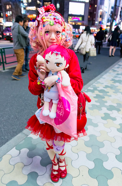
Japanese Youth Culture is very unique and has became very popular since its rise in the 1980's. No where else in the world has any youth culture like this and in Japan it is considered to be whats called 'Angura' which means it is its own culture. Within this extraordinary country, rather than just one type of  culture, it has many different groups that are called tribes, that are based on certain type's of looks. Many copy and look like popular subjects such as anime and musical inclination. The images below show how the Japanese youths dress very bright, colourful and is clearly very experimental. The main aim in most cases, is to be 'Kawaii' meaning cute and the distinct rejection to grow up and become more mature is the way teenagers in Japan are that has remained a key element in how they look. The beloved Kawaii trend has not just been apart of fashion, but because of the obsession with it, now is seen on products like handbags, household objects, cars and even planes, which is also apparent across the world with brands such as Hello Kitty being hugely popular in almost every country. There are many subcultures that are all very different but most still carry cuteness. Groups such as Decora, Lolita, Kawai, Ganguro, Visual Kei, Cosplay and Shironri each have their own different style and would be clear to see when in Japan and some being more gothic than others. If you are in a Japanese Youth Culture, the place to be seen in Harajuku, which is known as an international centre for the subcultures and other fashion interests. It is a huge community for shopping and eating. The main area to be for the youth culture is Yoyogi Park, where you can see other people with similar dress sense and those who are different. It commonly observes Harajuku fashion walks, which can be considered a competition to show off what you are wearing. Another popular area within the Youth Cultures is Akihabara or known as 'Electric Town' because of it being a main shopping town for electronic items, but is a popular place for video games and anime. Anime and Manga have created cosplay in Japan, which is when youth cultures dress up as their favourite characters in these animations. Music stars also copy their look off these comics and cartoons so their image will jump out at their audience. The music is not the only most important factor in their careers, but appearance is the next main influence, that can often be confusing for an outsider, because gender is not always clear to see. Ambiguity is not relevant in Japan because the beauty of these young men overstep's any reason for why they should not show it off, which hair and makeup does, that creates a presence and 'look' that will be remembered by their audience. Overall Japanese youth culture is massively popular and over the years has gradually became more common in Western countries, that can be scene even in the music business with artists like Katy Perry and Marilyn Manson, which shows the freedom in dress sense has made the world interested and amazed by these youth cultures.


Image's taken from: https://www.flickr.com/photos/tokyofashion/


Thursday 9 October 2014

First Set


Below are some of the photographs that I captured on the 6th and 7th of October that are a starting point for my project. I used my phone to take these images because I thought that if the other staff at work saw me using my phone at first, it would make them feel more comfortable at first, rather than using my DSLR straight away, which I will use next time I shoot. I think that these images could be more successful, but will get better the more that I shoot and the more places that I expand to take photographs of in and outside of the store such as the process the clothe's go through from the buyers putting an order to the brands, then the deliveries, to pro-pressing the clothes and presenting them in-store ready to purchase. In general I would like to capture as much as possible in the store as a whole but focusing on the behind the scene's and journey of the fashion that is there. Overall I am not that pleased with these photographs but as my first shoot, they are an okay beginning to the rest of my shoot's to follow. Today(09.10.14) we had a group critique to show our recent work. I presented a few of these images to the group, which made me feel a lot more motivated and excited to use my DSLR and to shoot again to get some good images that will feel like successful editorial work.


Saturday 4 October 2014

Mining Institute - Aaron Guy

On Thursday afternoon we visited the Mining Institute in Newcastle to listen to Aaron Guy, photographer and motion film maker, talk about some of his work that was commissioned by the Mining Institute itself. Other than his passion in the visual arts, his main interests are geography and geology, which are defiantly apparent in his work shown below. During the talk, I found Aaron's work very different but the more we were presented the more I began to be fond of it. It is clear to see that interests have brought out the best in his work because of how successful it seems to be. His project "Void." about a coal site that he grew up near, which is shown below, that was published in to a newspaper, with the images placed throughout, Aaron said the difficulties of this was the quality of the photographs. The colour would not be same they would not look as strong rather than in a photo book ect. But looking at this newspaper esque booklet, the grainy effect matches the photographs and gives the effect of dark, hardwearing material's which is what coal generally is. His work is definitely extraordinary, in the way he captures his subjects and what he involves, such as the elements and materials that is connected and what coal is made out of, making it seem like he successfully makes the most out of everything. Aaron's attitude towards his work was very professional and seemed like he has worked hard over the years with his photography and motion film, that he has linked together in his projects.


Images from http://aaron_guy.ideastap.com

Photograph's below are of the Mining Institutes Library. Taken On my iPhone, edited in the app Afterlife, Filter: Relic.