Wednesday 25 March 2015

Digital Archive & Website's

Building a website online can be difficult. There are a lot things to consider when having a website made, to make sure it is easy to navigate on and something clients will find visually interesting. The purpose of the website needs to be considered, is it being used to present archiving, sales, portfolio and even blogging. Many photographers use all of these for their work on their website but often can be a web link to another website more suitable, such as a blog. Updating a website often is crucial for clients to see what recent work has been done, but also should have options to see any other projects and portfolios that are relevant and include the best work you have done. Images should look sharp and the colour's should be correct, it could be misleading for viewers and result in less interest. Keeping it clean, simple and minimalistic seem's to be popular within photographers. It appears more professional and more appropriate when navigating around the website and making sure page titles, such as the contact page, are clear. Although many websites have a separate contact page, it is useful to just include all contact information on every page, small enough to not effect anything important but big enough so that it is clear to see and easy to read. This would make it more accessible for a future client.

During a seminar, we looked at different websites that provide templates but also build you website to your taste and requirement, that differed in price. We also looked at domain names and if they were available to what we would call our own photography business. Using .com or .co.uk as a photographer is the most appropriate domain name. Below is an example from www.fasthosts.com.


Examples of photographers websites.


Alamy

During a seminar learning about Digital Archiving and websites, we were shown stock photo website Alamy. The website began in 1999, when at the time there was already large agencies that provided stock images, but founders James West and Mike Fischer knew that the industry could change quickly and was an intelligent move in the website. This website unlike other stock image agencies, seems the most fair. It is a 50/50 commission rate on all images that can range from £15-£1000 and even more in some cases. It depend's on how the image is used from how much the photographer will be paid but for larger jobs it can be a very big amount. After 14 years after the website was founded, it now has the largest collection of images and videoclips online than any other agency. Alamy has paid out over $110 million to its sellers and contributors since it began and pays the largest royalty fee out of all the industry. Anything goes on this stock agency, there are no restrictions to what type of photography can be sold, whatever field any photographer is in then it can be submitted. The fact that there is so exclusivity from them and they do no further editing to your own image, really makes the website different and special from others. Retaining all copyright to your own work and being able to use it else where, makes yourself question why shouldn't you sign up. Students like myself, can upload images for free and gain 100% profit back for two years of registering. After hearing about this website I will definitely consider joining this website very soon.

Some screenshots of the website: http://www.alamy.com/default.aspx


Marketing and Promoting

Marketing and promoting a photography business is crucial to success and more clients in any photography career. Knowing who you are working for and who your ideal client is can shape a business and focusing on a specific part of the industry can result in working for a with who you ideal would like your client to be. By knowing who you want and produce work for can make your business and any previous work more appealing, even by just adding what field of photography applies to you.

Having a website is probably the most important and first part of a photography business the client is going to go, to view what work you have done to see if it appropriate for them. Photography websites tend to have a white background and a few pages (e.g contact page). Always having the best examples of work and keeping it updates shows the quality of your specialism to the client.

High quality customer service is always appreciated and keeping clients happy before and after the work completed for them, will be remembered and could result in more work in the future. Working successfully with one client often mean's more work will come from work of mouth also, from being exceptional during one job can lead to another as, customers will talk about the great work done for them. Facebook and any other social media's are also a great way to promote a business. All work posted can be shared by other people, leading other people to viewing it. Posting consistently will remind people what you are doing and that you are still there.

Attending exhibitions and events can also be helpful. Meeting people in person and explaining what you do has a stronger impression that a phone call or an email. It is a great opportunity to hand out business card that could result in a new client. A more expensive option in the marketing business is exhibiting work. Although it can be pricy, exhibiting can show on a professional level you are as a photographer, it can draw more people to your work that could then go on to follow your website and future exhibitions and also lead to future commissions. Entering competitions could also benefit and promote work. It will be viewed by many professional, well known and successful expert photographers that could result in opportunities that can be won, such as an exhibition in most cases, leading to connections in the future.

Copyright

Copyright is an area of law, that covers all aspects of photography. It means that the right of the copyright owner of the work, that in this case is photography, can authorise or prohibit certain things. It is a collection of rights that the copyright owner can also have that has little control over what the permitted acts are and also depending on the limitations to the copyright. The balance between the authors right and a right to creativity shows how it is a human right. In photography, copyright gives the photographer the rights to control how they use their photograph and also grants the photograph's to be used and available for payment from a client ect, as long as the photographer gives their permission to use the photograph. In the photography industry there are many implications of how copyright is exclusive to its owner. Permission is needed for others copying the photograph, infringement can be put forward if done so. When working with a client, exclusivity from you to them means they would have a more profound right to the images produced for them and would be more privileged for how they would only have access to them. Copyright exists in a photograph as soon as it has been taken by the photographer here in the UK, giving all rights to the photographer from the very beginning.

The copyright act in the UK: Copyright, Designs and Patents Act 1988 actually became effective in 1989, from other amended acts from 1956 and 1911. It looks at the definition of a photograph, still's from films, work generated from a computer and the originality in the photographs. It is interesting to see how much there is to know about copyright and how important it is when in the photographic industry and having a photography business of your own. It also goes into other details that would not normally seem to come straight to mind, such as can a photograph have more than one author. It seems to be possible for a single photograph to have two or more authors, which means two copyright owners, but can lead to complications like who has control over the work.

Employed photographers do not hold the full position of copyright in their work, unless in a contract or agreement stated otherwise, the copyright belongs to the employer. Anyone who is in a contract, tax and national insurance is contributed by their employer tends to mean that it is taken by the employer. A clause should be included in any employment contract, which should state who has right's to the photographs and how they can be used. Freelance photographers should also ensure a contract is brought up and stated they have copyright.

The length of copyright in an image is the length of the photographers life, plus 70 years on top of that and then it will be passed on. However it is a debated issue that has complex areas that need to be discussed when having a photography business. Extended copyright was applied in the 1988 act, which is all works were still in copyright at the end of 1995 plus 50 years for photographers. The revived copyright is also a term that means protections has expired, but is still protected by copyright.   Copyright is hugely important in professional practice and many photographers today are freelance or commissioned, and are the copyright owners of their work, but agreements must be made to make sure it is clear about copyright.

Pricing & Costing

To have a successful and manageable photography business, it is key to have a solid understanding of numbers and the cost of business: desired salary, total annual costs, non reimbursable expenses ect. It is important to have realistic goals for a profitable career, rather than having really high prices it would be more sensible to start and go on with practical fee's and have a consistent work flow to the quality you know you could achieve. To handle your expenses it is important to keep track and a record of every shoot is taken and any other professional and personal expenditure. Fee's are charged at a daily rate, that is usually on a normal day 7am-9pm. It depends on the experience, knowledge and type of shoot the photographer is doing, such as an editorial or advertising shoot could mean a larger fee calculated on what the images will be used for. In the Photographic Industry, we all want to be able to price and fee our photography as high as we can, but being realistic will mean a more sustainable future.

Knowing information about your client before a shoot and how to fee them is a must. For example if you are shooting food and is for a local restaurant, you are not going to charge them as much as you for a major food chain such as pizza hut. But feeing them appropriately to your own daily rate to what it should be, needs to be applied. Production costs should also be applied, different shoots may require different equipment and specific requirements that will show up on your expenses. The investment on the shoot should be evaluated for what will be used. Even small things such as catering food and drink for models, make-up artists and hair stylists need to be included to keep on track of all costs used.

Clients will always want to know prices and costing straight away. They will also want to know why does it cost so much or why it doesn't look to be costing enough. By knowing all your expenses by keeping organised, so that you can explain and even show the client through spreadsheets so that it is easier for them to understand why. Sometimes a price is best decided on by negotiating a price with the client to see what is most suitable. Pricing can often result is a client going against the photographer and cancelling the shoot. However as the photographer it is also critical to know when to turn down a shoot also. For every cost of every shoot there is a minimum for what can be charged, which means that is the price for what is needed to cover any costs and salary.

How do photographers make money:

  • Selling price higher than costs = profit margins.
  • Value = quality, reputation, experience, location, competition, price.
  • Is the price profitable?


Cost:

  • Overheads = General to business
  • Direct costs = Specific to a piece of work e.g film, editing, prints
Break even:
  • Costs, value, income are equal. 
  • All can be used as salary.

Contracts & Releases

In the Professional Photography business it is important to keep track and know about the business and legal side of the industry. Whatever photographs are being taken, as a photographer being paid for produces them, you should protect yourself with a basic contract, stating the intention of the work being done, the whereabouts, pricing and the agreements made between photographer and client. One of the reason contracts are so crucial is anything could go wrong, such as camera equipment not working and any injuries made to yourself or anyone around you. It also makes the job more formal, so that if you are are working with a client that is new, they would know and appreciate the contract being made. 

The basic info on a contract about yourself should be:

      • Name/Name of business
      • Business address
      • Relevant contact information
      • An arrea to sign your name.
The clients should be exactly the same, but the date, time and location for whereabouts you are shooting. 

It is also essential to include a clear precise amount of time you will be shooting for. In many cases such as weddings, the photographer often has to work a few more hours than planned because of the reception going on into the evening. You should shoot along as the client needs and plans you to so that the contract stays the way it was intended to. 

Pricing of contracts should be included and will be different every time depending on the photographer, type of shoot and how many hours. The flat rate or hourly rate is different for photographers depending on how they work. It should be as specific as it can be so there will be no confusion about the agreement afterwards. Anything that is not stated in the contract, could result in losing time and money, including everything that comes after the shoot like post processing which should also be covered.

The type of payment should also be stated in the contract and when you should receive the payment. This means how the payment should be delivered, who will be paying you and if you require a deposit. A date to show when the payment is due should be clear and a receipt or invoice is required. The issue of late payments can also arise. Many photographers add a late fee to their contract, showing that the client will pay extra for every day/week they fail to deliver the payment, which the contract should also state what should happen if it is a complete failure to pay as well. Any client should understand and respect this issue as it can happen quite a lot with the wrong clientele, it should come across as professionalism and not greediness. 

The rights to your images and the clients also is necessary to include. The question of who owns the images could result in being a huge problem if not dealt and stated with. Every photographer is different and so many give all rights to the client so that they can do what they will with the images. Others will not give the full rights due to how they could be used after they have finished with the clients, such as the images being printed else where or even being sold on stock photo website ect. An agreement of how the copyright of how the photographer would like the images to be used is definitely a crucial point for a contract, as no photographer would like to see there work being used somewhere where they did not agree too or taken credit for. 

The amount of time the images can take to be delivered to the client, whether it may be printed or just by a USB. The client should know when to expect to receive them as they will want to use them for their own purposes(that are stated in the contract). All the contract needs to say is the amount of time that you will preform your job as the photographer and how you will prepare and post process the images. You and the client should agree on a appropriate time, it is important to give as much time as you need to give the best results that you and the client will be both happy with. 

The collapse of the contract is a possibility that can happen at anytime due to any cause. An emergency could arise and there is nothing that you can do to stop it. However if stated in the contract and protected, this issue can be avoided. An agreement stated in the contract explaining in the event of an emergency or equipment not working that you will return the money to the client and claim no liability.  It is necessary to protect yourself in case of these situations, that will benefit you and your client from any legal battles. It should be a contract that will gain good results that you and the client want and will take interest in. 


Tuesday 24 March 2015

Group Crit and Reflection

In our group crit on friday(20.03.15) each group presented their work on the magnetic board in the studio. We then proceeded to talk about each others work, about the positives and what could be improved on each image. Everyone's work represented Vanitas or Nature Morte and had symbolism within the objects that were used, just light paintings in the 15th century such as Treck. The feedback for mine, Lauren's, Sophie's and Jess' image was very strong because of the way we placed the flowers, which seemed to be very popular with its audience. No one else had done anything like this so it stood out from the others to be quite different, and once everyone knew the meaning behind it, it was clear to see why we arranged it the way we did. A way we could improve that was mentioned was the lighting and if any of us were to to it again we should change the lighting as it was too harsh, as to how the light source was in the paintings.We also did not follow this mini-assignment, to recreate the painting using modern objects, which would be interesting to do if it was done again.  It was great to see other work from the different groups to see how Vanitas and Nature morte was presented, through how people understand the meaning behind it.


Nature Morte and Vanitas shoot

For our mini assignment for this part of the module, Still Life: Nature Morte and Vanitas, we were to recreate a painting from the 16th or 17th century, when this genre was very popular, presenting the subject with modern materials and objects. We were assigned to groups to discuss the painting given and how we were going for recreate it. In the same group as myself there was, Katie, Lauren, Jess and Sophie. We then decided on how and what we were going to do and gave ourselves a certain object we would then use in the shoot. All of us decided it would be best to shoot the following day (13.03.15), and to shoot using the Phase One camera as it would overall give us the best results with our images. It taken us around half an hour to set up, which we used the boom to attach and arrange the flowers on using masking tape, so that they were upside down. The decision to use the flowers upside down was a completely last minute idea, that we all agreed on as it was an interesting and different way to present them, rather than on the painting, were they are just in a basket properly upright.


Once we had completed arranging the flowers, we places other objects underneath them on a table with a black cloth over the top. We used objects that were similar to the ones that are in the painting such as the fruit, which we slightly changed by using apples and strawberries rather than pomegranates and peaches, due to the thought they are a more popular fruit of today's society. Shell's were also used, like they were in the painting. The use of dead roses was also an important element, a few were arranged around the bunch of flowers and then a gathering of the leaves below it, so make it appear they had fallen. In the painting the objects are arranged on two levels, unfortunately we did not have anything that was like this, only a wooden frame shown in the image below. 


In all of the paintings that we had previously were shown in a seminar of Nature Morte and Vanitas examples, the light source always comes from the left hand side. We placed an Elinchrom light, on the left sides slightly in the middle so that it would light up and create shadows similar to how it is in the painting. After taking a few shots and placing the light slightly different we were then happy with where it was. After a few attempts the whole arrangement and idea of the objects did not seem right and with input from Ant and Tim, who though there was too much going on in the image and was not really working. We then decided to go for a totally different appearance and idea, and taken all of the unnecessary objects out of the picture. In some of the images taken, it emerged to us that it was much more successful without the shells, wooden frame and fruit, but with a couple of the dead roses added to the wooden board with the fallen leaves. 

The meaning of our piece had slightly changed throughout our time planning the previous day and during the shoot. However we knew that it would be questioned as to why the flowers are upside down, rather than on the original painting they are displayed in a normal way. They are that way because it represent life following in to death, the fresh flowers then looking down on to dying flowers that are then followed by the dead roses that have then fell, which is portrayed as death.

A couple of complications occurred when shoot which was that he dead rose bud's were very dark and there was a few problems in lighting a couple of them on the right side. We then added the board with a gold reflector over, which worked successfully in making the rose head's lighter. This finished off our lighting and equipment that was used and was then on the road to producing our final image to use. Other problems that cropped up was the arrangement of flowers and how it had to be altered a few times to create the display we wanted, as at first there was a lot of greenery  and stalk but not enough flowers, I think that this was due to fact not a lot of planning had gone into this which would of been more appropriate. 


Overall I feel that our shoot worked very well and were successful in recreating our given painting. We worked well planning and shooting in the studio together and all having our own input into the final result. Although it does not look similar to the painting due to the flowers placed upside down and the lack of modern objects that were supposed to be used, it represents still life Nature Morte correctly in the way we have been learned. I would definitely like to continue shooting this style of still life and would plan this shoot again so that it could be improved and more successful.

Final image.


Nature Morte and Vanitas influenced Photographers

During our seminar with Jill speaking about Nature Morte and Vanitas, we were also shown still life photographers who had influences of Nature Morte and Vanitas in their work. Each photographer's work still includes the stillness that is shown in still life paintings, and consists of objects that represent and have an important meaning. The work of the following photographers have clearly been influenced by past paintings and still have elements that were important in past art work, when still life was very symbolic to everyday life. Modern photographers have made their still life work more influential to todays society and what is relevant to their own lives and others around them.

Marian Drew
Marian is one of Australia's most powerful and significant contemporary and still life artists of today. Her Still Life project "Australiana" from 2003 to 2009 presents images of dead Australian bush animals, that she had found already dead, placed next to objects that are somehow linked together. Her images from this series were all really interesting to look at because of the animals and how Marian had placed them. It is clear to see how these photographs are influenced by past vanities and nature morte painting because of the style and the way everything is placed. The different element Drew has used that is not the same as other still life vanitas styled photography and paintings, is that she has a background in some of the images from this series that is not white or black, it appears to be another photograph or an actual environment that she has used behind the objects she is photographing. I think this works with these images because of the narrative behind it being about her home country of Australia and the use of animals that are from there.


Lorenzo Vitturi
Lorenzo Vitturi's series of work "Dalston Anatomy" presents a book full of colourful images of people and surroundings of east London's Ridley Road market. He focused on this because it was local and special to him, but also starting to change due to gentrification. It was important to Lorenzo to capture this area before it transformed completely. The photographs from this series are seriously different to anything I personally have seen before. They are so individual in the use of colour and use of objects and people, it really does represent this area of London he is photographing. The still lifes that are included in this series are a mixture of fruit, vegetables and objects from the market and all placed and sculpted in a way that is connected to what Lorenzo is representing. In an interview with magazine Of the Afternoon, Vitturi explains that he arranges these sculptures because he ttys to find anatomical similarities between the objects and the people that he photographs because they show how everything about this market is connected and because the sculptures only last a couple of hours representing how these markets and people he come's across only last for a certain time too.


Tuesday 17 March 2015

Nature Morte and Vanitas

My new mini-assignment for this module is related Still Life in Nature Morte and Vanitas. At first hearing of this subject I was clueless, but after a seminar and insight into what it is and would involve, it became a lot more clear. Vanitas and Nature Morte were used in historical still life paintings of a group of objects that all generally represent something. In the past the objects were commonly flowers, food, books, instruments, insects or dead animals, which are all connected to life in some way. The french term for still life is nature morte meaning dead nature, after learning this it shows what the painting's mean a bit more clear to see. In almost all the paintings we were shown in the seminar, the light source always comes from an area on the left, sometimes lighting up the main object then slowly becomes darker to the other not so meaningful objects, it is important to notice this because it plays with flatness and almost give a 3D illusion in a number of paintings. In all of the paintings we looked at all had diagonals and vertical lines that lead to the main objects, where ever the came from in an area of the painting, highlighting what the viewer should be looking at the most. Another fact of the painting's that occurred in every single piece, was that they all contained objects that represented wealth and power, along with the colours in the paintings were used such as bright red, purples and greens all relating back to wealth also.


This painting was by Treck in 1648, and is called "Vanitas Still Life". It contains objects that Treck used wanting to cause the viewer to reflect on mortality and human ambition. It is clear the see the diagonals in this painting, the white stick is pointing to the knights armour which then lead to the flute that is pointing to the skull, that makes it clear to see that the painting is Vanitas because it includes a skull. 


A painting that I came across on the National Gallery website by Harmen Steenwyck in 1640, titled 

Still Life: An Allegory of the Vanities of Human Life. The painting includes objects that symbolise wealth such as the Japanese sword and shell. The book and instrument which looks to be a flute representing knowledge. The skull dominated the painting, guiding the viewer to look at it first, shows how it overall represents death in the whole painting. 

Monday 9 March 2015

Reflection

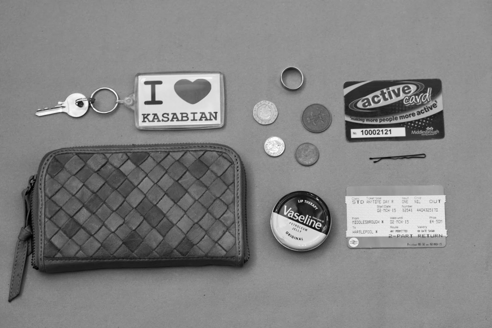
On Friday (06.03.15) e had our group crit, showing what work we have done during this mini assignment. We were required to produce at least three images and present them on our blogs (see previous post) and print one of them A3 or 12x16 for the crit. We all put our print on the metal wall in the studio to view in to depth and then Jill gave us a sheet with different questions on a someone else's work in the class, such as the context behind it and the technical side to shooting the image ect. I find it useful and important that we do these critiques on our work because it gives feedback on how we are doing and if it is working. In this crit I enjoyed how we had to focus ourselves on one individuals work rather than looking at everyone's because it meant that we could receive a much more in depth feedback and consider other elements that maybe would not have been included. My idea was to photograph the inside objects of purses and wallets. I placed them on a brown surface and shot them in a bird eye view angle, so it was clear to see the objects I had chosen to use out the purses and were all visible in the same aspect. I think my idea was successful at portraying documentary still life and had context, which was that people often carry objects in their purses or wallets that can have sentimental value to them, such as photographs or rings. If I was to improve I would definitely add a title to the three images, rather than a piece of text as I think it is clear to see what the images mean. Overall I have enjoyed this mini assignment the most out of all the other genre's we have explored whilst researching and shooting still life. I think it is because I have grown an interest in documentary photography but also as I have gained knowledge into what documentary still life photography is. I would definitely like to carry on shooting this genre and continue with my idea from this mini assignment.


Documentary Shoot

For my first shoot for documentary still life images, my idea was emptying contents of purses and wallets on to a plain background and arranging them to what fit and looked best. I thought that this was a good idea because people don't only just keep their money and cards in there wallets, sometimes personal objects and photographs are also often held in their. I think this can show the personality of an individual through what types of items they have, what loyalty cards and receipts are in there. Below are the 3 images from this idea that are required for this mini assignment, part . I think I have been successful in presenting my idea and have arranged the objects in a way so that you can see what they are and what the context is. From an audiences point of view, I think it is easy to see what my aim and intention to show that in the images are supposed to be an insight of the personality of the individual's purse/wallet belongs to. I think that I have also succeeded in producing still life photography in a documentary style, the objects are all placed individually and are on a plain background, drawing the viewers attention to the objects and its meaning. I originally shot the images in colour, but once edited I found that I preferred them black & white.


Documentary Still Life Photographers

During a seminar with Jill that introduced us to documentary in still life photography, we were shown  different photographers who are considered to be in this genre. We looked at a number of photographer but the following three are the ones that stood out to me the most. Looking at photographers helped me realise what to look for and what I could photograph in this mini assignment and understand it more. 

Raphael Dallaporter. 
French Photographer, Raphael photographed land mines in a project called "Antipersonnel" taken in 2004, that were found from all over the world from different wars and conflicts. They were captured simply on a black background which looks to be studio light. The objects used do not seem to personal in anyway, but when thought about it the way the have effected people over the years since their invention, they have killed millions of people. Also the fact they are made to destroy areas of land that involves killing people gives it context alone. After reading about the project on his website and looking at the images in more detail, it became clear to me how different land mines can be in their appearence and in this case Dallaporter has made them look strangely intriguing and beautiful. At first glance I had no idea what the objects were but after being told it made send. I think Dallaporter has succeeded in this project in how the context and meaning of his series speaks out and is clear to see with an explanation. He also achieves this in how simple he has shot the land mines, making them simple and all about the object themselves, not focusing it on anything else. 

screenshot of the project from Raphael Dallaporters website.

Stephen Gill.
Stephen Gill's work, similar to Raphael Dallaporters in the fact on each photograph focuses on one object and features the same type of objects throughout the series. Gill's project "A series of disappointments features each black and white image of a betting slip, folded or scrunched up in the way of the person it belongs too made it to be that way. I really enjoyed looking at this piece of work in the seminar and found it to be my favourite of all the photographers we looked at because of its simplicity, but context behind it. The photographs are all folded in different ways and all feature different inscriptions of whatever bet was placed by the individual, which to me indicates an indication of the persons personality. Below are three of the images from the series.


Narelle Autio
Narelle Autio's work also stood out to me as being similar to the two above, as it is also one object in each image on a plain white background, presenting a simple appearance. "The Summer of Us" series captured in 2000, won Autio a number of prizes and exhibitions. The full set of images are object's that she found on the Australian coastline, supposing to represent Australian life by the sea. A lot of people who lived similar to her when this was captured, could relate to the series and it is easy to see why. With every day objects that people come across in their homes and on the beach. I am not as fond of this set that what I have seen from the other photographs from above, because I feel it is quite amateur and something I have seen before, however I do think it represents documentary still life very well and it's context seem's important to Narelle and those who have viewed it. 


Documentary Still Life

For our third mini assignment for this module, I was set out to complete a series of images that represented and portrayed documentary style photography in still life. At a first thought, this seemed like quite the challenge as I could not think of anything off the top of my head that strikes me as documentary still life, or any photographers of this genre. However after a seminar within Jill, it became clear was was required of this and a few ideas were coming to my mind. During the seminar we looked at different still life photographers that showed this, such as Raphael Dallaporter who photographed Land mines on a simple black background, and Stephen Gill who collected betting slips and photographed them in the way he found them. All of the photographers Jill showed us seemed to have a personal element to them, in how they are related or have effected people who are associated with the objects that have been photographed or how that have been used. For our own mini project the context within the image is very important. Whether it speaks out to the audience just by looking at the images or if it comes with text or a title, it makes it way more interesting if the meaning is shown. Also we are to use only daylight when capturing my documentary still life images, which personally I prefer that using studio light and I feel it will make it look more real and connected to what the photo's will be about.

Thursday 5 March 2015

Product Shoot

For my product shoot I decided to use a watch and its box. Not the best product to use I must admit but for quickness and easiness I decided to use something that I own for connivence. To capture a product shot, it must be taken in the studio using a digital camera, studio lights and a software such as capture one. The studio is not one of my strong points so it was quite the challenge. I set the products up in a way that I feel was appropriate to show the product and was clear for the viewer to know what it is. I used a table for underneath the products so that they were on a good level to photograph on. If I was to do this shoot again I would definitely put more time in to it as it was very rushed and I would of used different products to photograph so I could of has more of a range and options to choose from for my final print, as this was my only product shoot. However I had never produced any product shots before this, and have learnt a lot about the industry and product campaigns from seminars and research.


Wednesday 4 March 2015

Visiting Lecturer - Craig Astley

In our professional studies session on the 9th of January, we had a visiting lecturer. Craig Astley is the marketing manager and the Baltic Centre for Contemporary Art in Newcastle. Craig talked about a lot of different positions at the centre that I personally did not know about such as what they call the "Baltic Crew" who are curators all around the the centre. The Baltic holds a range of artists work that change throughout the year. Craig took us through their website which could be very helpful to my studies as it contained a range of resources from every artist that has exhibited their. He also showed us the library section of the website that has access to thousands of creative books that the public can have access to when visiting the centre, but also our college can have access through the website its self. Craig's talk was very interesting in the fact that I gained knowledge of positions and uses of the Centre. It was also great to see in his presentation the progress the Baltic has made from its very first opening. Overall the talk has made me want to visit the centre's library for definite.


Tuesday 3 March 2015

Food Shoot


I took this image using my iPhone 6. The quality and colours that are brought out in this camera, that could be any digital SLR, would never be known that it was taken on a phone camera unless stated. I was drawn to photographing this type of food because of the colours and how good they look in and out of camera. Healthy food is great to photograph because of how appealing it looks and is great for all different types of audience. I think that this image would suit being in a healthy recipe book or food/fitness blog. The ingredients of the the food in the image is clear to see and would be easy for the viewer to recognise. I also think it would look very good in a magazine in a editorial campaign with a piece of text to go along side it. I plan to use this image as my final print for food photography as it represents what it is supposed to do, look appealing to its audience so that the viewer would go out and buy/try the food. Although it has been shot on an iPhone camera, I don't think that it affects the quality of the image. 

Mario Testino "In Your Face" Exhibition

World Famous fashion photographer Mario Testino's latest exhibition "In Your Face" was held at the Kunstbibliothek museum in Berlin and fortunately whilst visiting the city with the college, I was able to visit this fantastic exhibition. The show featured around a 125 pieces of Mario's work from different points of his photography career, presenting a full range of his photographic portfolio. Following on until July, it has been the first time "In Your Face" has ever been exhibited in Europe. Its success at Boston and Sao Paolo, will definitely follow in Berlin because of the popularity and skill of Testino himself but his work has fascinated people all over the world for many decades. We also had an audio guide when walking round the two floors of Testino's work, with a little screen that showed a video of how Testino works and how he came to produce some of the photographs in the exhibition. This was useful in that it was like a sneak peak in to his life and and insight into how his photographs have been so successful. The photographs in the exhibition celebrate the diversity and contradiction in his work, which celebrates each different image that was used, that include editorial, portraits, fashion and his own private projects. In my opinion the exhibition was very successful in the fact it presented a range of pieces from his career and different photographs I had never seen from his portfolio before, but also projects that that have never been published. I would definitely recommend trying to visit this exhibition for fans of Testino. Below is a quote from Mario Testino talking about this exhibition.

"In Your Face, for me, represents the most free way of expression", says Testino. "As an image-maker people always want to put you in a box. I believe we are made of many different aspects and not always are we allowed to let all these different aspects show, let alone to live next to each other as they do in this exhibition. This particular hanging style for these photographic works allows all of these different aspects of my curiosity to have a conversation; they not only exist on their own but trigger a reaction when being next to each other."

1.5 Shoot


Above are a few images from a shoot I have recently taken at home, using a reflector to bounce back the light coming in through the window, so that it would produce more light on the area's of the food I wanted it to in camera. I think that these images are successful by highlighting what ingredients were used when making the product and have lit up in showing the colours of the bread and vegetables in the sandwich, which I feel makes it look more appetising. I wanted to focus on only certain parts of the food but also including some of the ingredients used because it form's a very homely feel, as if the audience could of made it themselves and it in front of them ready to eat. If I was to shoot this again, I would style the food more as I think inside the sandwich looks slightly messy, and so if styled more appropriately would of looked tidier. However I do believe it was a successfully shoot and I have achieved in portraying what the food is meant to be and appears appetising to the audience. 

CV

Having a CV is very important to securing future jobs and partnerships and also making a good first impression on the employer. Without a CV you may lose a chance at a job you have always wanted and worked hard for. A quality CV will boost the chance of maybe getting an interview and eventually the job, so highlighting key skills and qualifications that are linked with the potential job. The presentation is also very important because you are not going to appear organised and skilled if the layout of the CV is not tidy and spacious. In the photography industry it is important to have different sections that focus on experience and awards that you may have acquired during your photography career. Employers will be interesting in any awards or commissions because it shows that you have experience in different ways whether it is connected to the use of software, studio environments or specialising in difference camera formats and also specific genres. Below are some key points I feel are important when writing a CV.

  1. Personal Details such as full name, address, phone number and email address are a must. Date of Birth is optional, but depending on the job it may be useful to include it.
  2. Summarising a personal profile of areas of interest and enthusiasms of the job you are applying for is useful, as it shows your eagerness and motivation.
  3. Key skills such as knowing how to use a computer or any other softwares or knowing how to work a till, show that you learned things from precious jobs and could be relevant.
  4. Education and Qualifications ar very important because it shows what you have achieved in previous years that are relevant.
  5. Make sure it is clear and concise, a good structured layout and a professional font. 

Sunday 1 March 2015

Beauty Brands - Product

Many beauty companies such as Clinique and The Body Shop have special lighting techniques to make the product look more professional and appealing to its viewer, whatever advertising campaign it may be in. I have included a few images below both from Clinique and The Body Shop to show some examples of how their products are shot. Both of the companies products are shot very differently, but works for them and their customers as they are both very successful and popular within the beauty industry. The photographer's aim is to present these images in a way so that they will sell and make them easy on the eye of the viewer, so that it is easy to understand what they look like, what they are called and what they do, so that it will result in the viewer being able to purchase it easy and know what they are looking for online or in store. The semiotics of product/advertising photography is apparent in the images I have used, which is very popular among this industry. It creates a message to the viewer of what the product has been made out of or something that connects to it, often appealing to the eye.

Clinque

The product above is Clinique's 'Smart Custom Serum' that is supposed to understand the skin and make it appear more radiant, reduce wrinkles ect. The product has been shot in a very clean cut and sharp way and the colour being silver/white makes the product appear strong and powerful. The image includes DNA/anatomy strands indicating how the serum understands the appearance. 


This Clinique product is a cream for the eyes, to diminish dark circles ect. The product is shot very clean cut and sharp such as the one I have included above, like all Clinique products are. They are shot like this because it is indicates information and appearance about the product, so that it is very to the point. The black and white light reflections are also clear to see here. 

Below I have included a video from a photographer on youtube, that explains how to get the lighting techniques Clinique create to get the white and black reflections, so that there are no reflections of camera's or equipment that is used. I found it very useful and will definitely be using some of the hints and tips presented in this video for product shoots in the future.  


The Body Shop


Above is The Body Shops image of a new product that is a over night serum oil that is meant to give a fresh glow for skin so that it appears you have had eight hours sleep. The photographer has successfully shown what the product is and what it is called. Where the object is placed is also very important because it needs to be easy to understand. The way the top of the serum bottle has been placed has been cleverly done because of how it is balancing and leaning down towards the right, creating a large droplet of what colour and texture the oil should be, including a piece of large text saying it has a high content of a certain ingredient, linking with the size of the droplet. The studio lights used have created a glow on the product, complimenting the colour and making it appear bright and fresh which is what the product is meant to achieve. 

These Body Shop products are part of their Green Tea range. As many people already have knowledge that Green Tea is meant to be very good and healthy, the viewer of the ad can not only drink it, but now they can treat their skin in many ways as well. The combination of the tea leaves and green smoke like effect create a sense of freshness and detoxing for the skin. The photography has included these because it is more appealing for the customer because of the reputation the company rather than the single product, such as what Clinique use. 


This image was just a tiny part of one huge image. I have just screenshot a small part of it because I did not feel is was necessary to include all of it when it is clear to see some of the products and other objects. This product shot is part of The Body Shops "Honeymania" range. The colours of the products and background work very well for what the product includes, which is honey. The photographer has placed one of the products so that you can see inside it, so that the viewer can see the texture is like honey. The lighting the photographer has used lights up the very edges of the products just giving it enough glow.